In the middle of the FIAC contemporary art fair which was held last month in Paris, Kris Van Assche unveiled quietly his first collection for Berluti to buyers in showroom appointments. It was presented in a temporary glass-walled pavilion designed by Jean Prouvé, set up on the Place de la Concorde in Paris.
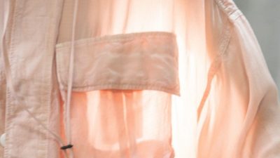
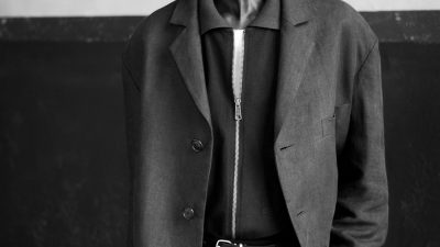
Breaking with the sleek, androgynous creations of his predecessor Haider Ackermann – the biggest sign of change was the Berluti logo’s serif font replaced by a sans-serif typeface of which the corners were shaved off, ‘’to signify new beginnings’’ – the collection was designed as a prologue to his first runway show, scheduled for January. The mix of tailoring and sportswear that has been a trademark of Van Assche’s previous work, both at Dior Homme and for his own label were strongly highlighted here for a new intergenerational era. The ‘’Scritto’’, an eighteenth-century manuscript motif that normally appears on Berluti shoes, was used in several garments in the collection. Meanwhile, the Maison’s patina signature appeared in a dual blue and red colorway in accessories and clothing. Completing the collection were a new, chunkier sneaker design dubbed the ”Gravity” and the archival ‘’Andy’’ loafer now available in creepers a creeper, underlining the brand’s push into the sportswear segment.















Comments